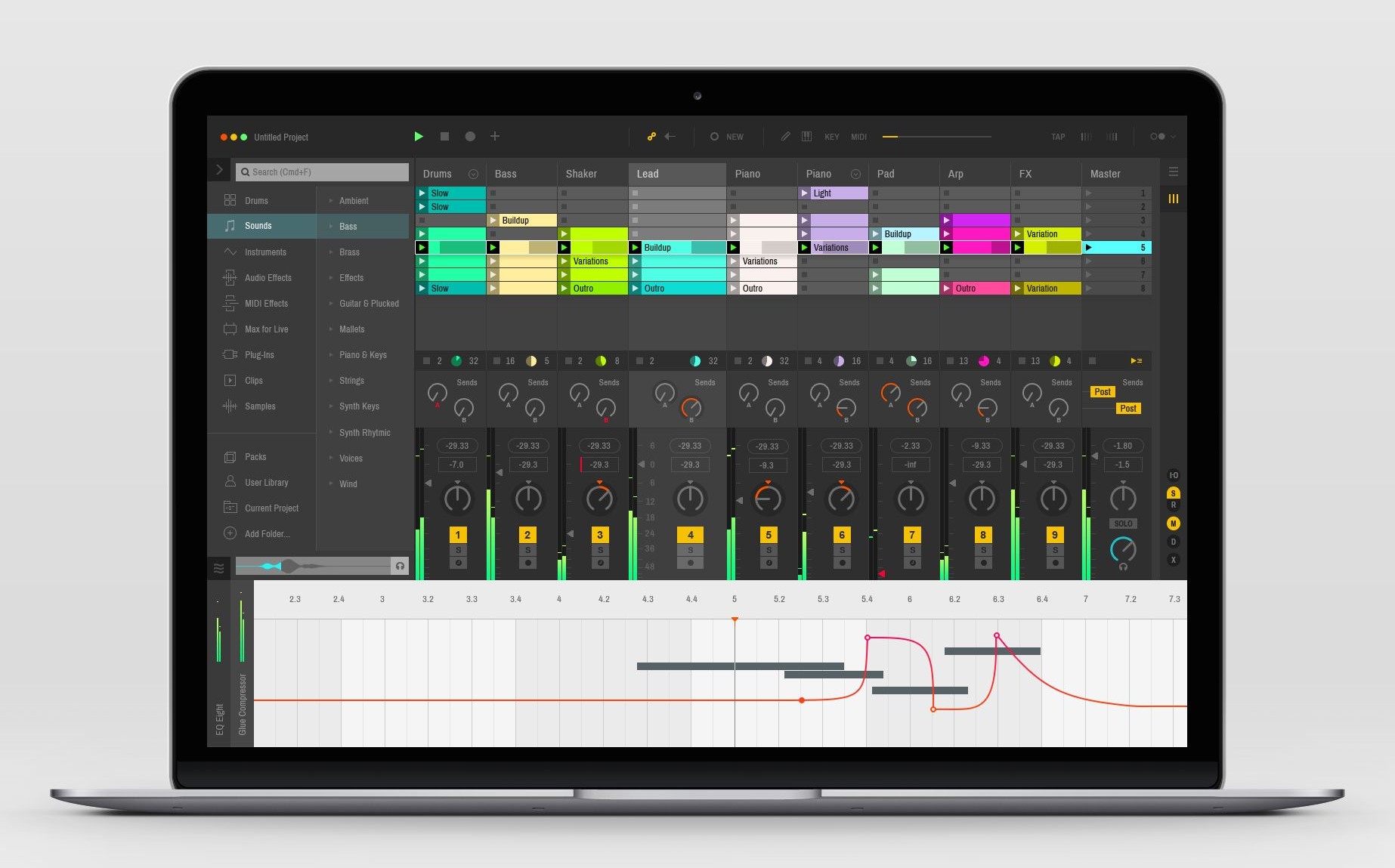
It’s no secret Ableton Live is the most beloved DAW for creating electronic dance music. It’s also no secret that the Live interface is fugly. Its spartan, grid-based layout has become a hallmark of effective, no-nonsense musical GUI design. Yet there is still something…missing. Maybe it’s the light grey that went out of style in 2009. Maybe we’ve just been looking at it for too long. Maybe it’s time for something new.
- The Menu
- Clip View
- Mixer View
Designer Vlad Shagov thinks he knows what it should look like. Boy howdy, is he right. Vlad’s absolutely killer designs focus on depth, clarity, and contrast. The base elements are darker, the the colors are more vivid, and dammit the thing just looks cool. It’s the Ableton Live interface upgrade we didn’t know we needed until we had it in front of us.
“I know that Ableton Live’s interface is already simple and flat. But I was trying to make it look even more clean.” – Vlad
It might seem like a pipe dream that these designs would make it into Ableton Live X, but there’s actually precedent for this kind of thing. In 2011, Apple hired jailbreak developer Peter Hajas after his MobileNotifier hack totally blew Apple’s notifications out of the water. Before you knew it, Apple’s notifications had been totally redesigned, and Notification Center became a reality.
We aren’t saying that Vlad’s concepts will be picked up, or that he’ll be hired by Ableton. What we are saying is that, according to Vlad, “Victor Mark from Ableton followed me yesterday. So, one guy from Ableton already saw this ;).” Maybe that’s the Ableton gods about to smile upon us.
Important things happen in Pacific Northwest nightlife, and DMNW will send you alerts!

